From the Flesh (jeh_decay)
Released Sept 29th, 2007 (Download zip)- Design Goals:
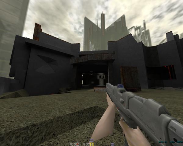
 something that was based around a central building, just to break away
from my earlier habits of just doing landscapes filled with ruins. I
wanted to see some close up super-shotgun combat inside the building,
and some action outside as well. Aesthetically, I had wanted to do a
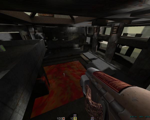
bleeding building for a while - I thought it was a nifty image. This
image took over much of the design, as it started to mold into the idea
that it's an old decaying living thing that's rotting from the inside
out.
 - What Worked
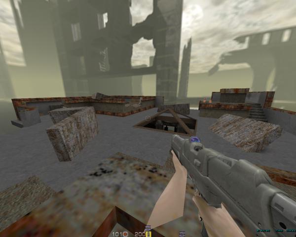
 This led to the old habit of filling it with ruins, but it's been
a habit that's been effective in the past. Overall, my intentions for
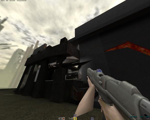
the atmosphere went off perfectly. Even the darkness became something
that could be used to close up the distances, and I hope that other
players see this as beneficial as well.
 I'm not a big planner (though I'm making efforts to get better at this), so a lot of the areas evolved as the building went on (ie I need a third jump pad up to the roof, this area is too linear, etc). As building went on, I think I found a good balance point of routes without turning the level into swiss-cheese.
Gameplay-wise, it turned out fairly nicely, with areas for a variety of situations.
 It being my first Q2 map, I had to experiment a bit with item
placement, but I trust my instincts on the placement generating
movement and area priorities well. Gut instincts also played a part in
those areas where I had no great ideas, but they came about naturally
anyway. I guess that's why I like mapping ruins: just by breaking stuff
you can make something uninteresting into something useful.
It being my first Q2 map, I had to experiment a bit with item
placement, but I trust my instincts on the placement generating
movement and area priorities well. Gut instincts also played a part in
those areas where I had no great ideas, but they came about naturally
anyway. I guess that's why I like mapping ruins: just by breaking stuff
you can make something uninteresting into something useful.- What Didn't Work
 changing my plans. I didn't plan several of the routes that ended up
being in the final product. Though I think I got lucky, I'm going to
need to learn some better approaches to going into a map with a good
design in place. Flexibility of design is one thing, pulling it out of
my ass completely is another.
changing my plans. I didn't plan several of the routes that ended up
being in the final product. Though I think I got lucky, I'm going to
need to learn some better approaches to going into a map with a good
design in place. Flexibility of design is one thing, pulling it out of
my ass completely is another.In the end, the biggest issue became the performance hit inherent with it's open design. The skylight, outdoor areas, and general flow meant that it became hard to divide the map properly, causing slowdowns on some machines\clients. I released the map noting this, and it's something I'll have to be mindful in my next projects.
I don't know at the moment, but it may be *too* dark. Time will tell.
